Windows Phone was fantastic. I loved Metro UI’s clean and straightforward aesthetic. Nokia Lumia devices were unique and fun, with an energy we haven’t seen in smartphones since. The phones were fun to use as a tech enthusiast, and I was disappointed when Windows Phone met its demise. Microsoft didn’t convince developers to bring major third-party apps to its platform, and devices like my Lumia 1020 quickly faded into history.
Even though the Windows Phone platform failed, I was shocked that many of its features never found a home with other manufacturers. Let’s look at what made Windows Phone special and what features I’d like to see brought back to modern Android devices.
Hardware built for a purpose
Unique with more than a little flair
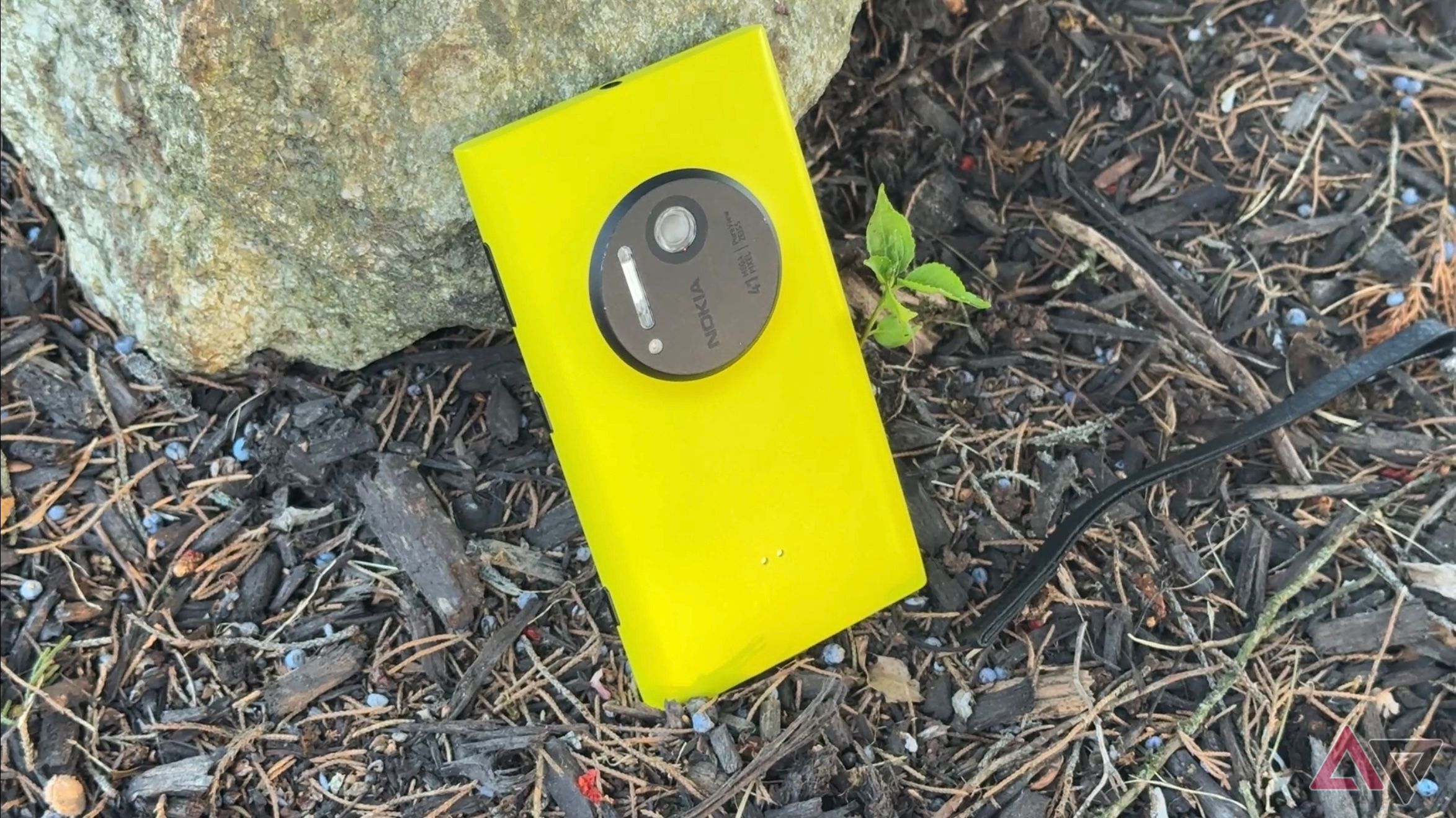
Windows Phone hardware was so much fun. Although Samsung, HTC, LG, and others made Windows Phone devices, I focus on my experience with the Nokia Lumia series. I loved how purpose-built the hardware felt. The Lumia 1020 was the first time I experienced a camera hump on a phone, and it was for a reason. It featured an excellent 41MP lens with Xenon and LED flash in 2013. It took phenomenal photos, and you can still see content creators on YouTube comparing images to phones released this year.
Nokia didn’t stop there. The Lumia 830 was a thin and light mid-range phone with fun colors and interchangeable backplates. I still adore my Lumia 930, which sported a Snapdragon 800 and AMOLED display. Nokia also had a large phone. The Lumia 1520 included a 6-inch display. While that’s nothing compared to a Samsung Galaxy S24 Ultra, it was big for the time. Microsoft may not have gotten Windows Phone across the finish line, but it wasn’t because of lackluster hardware.
Read our review
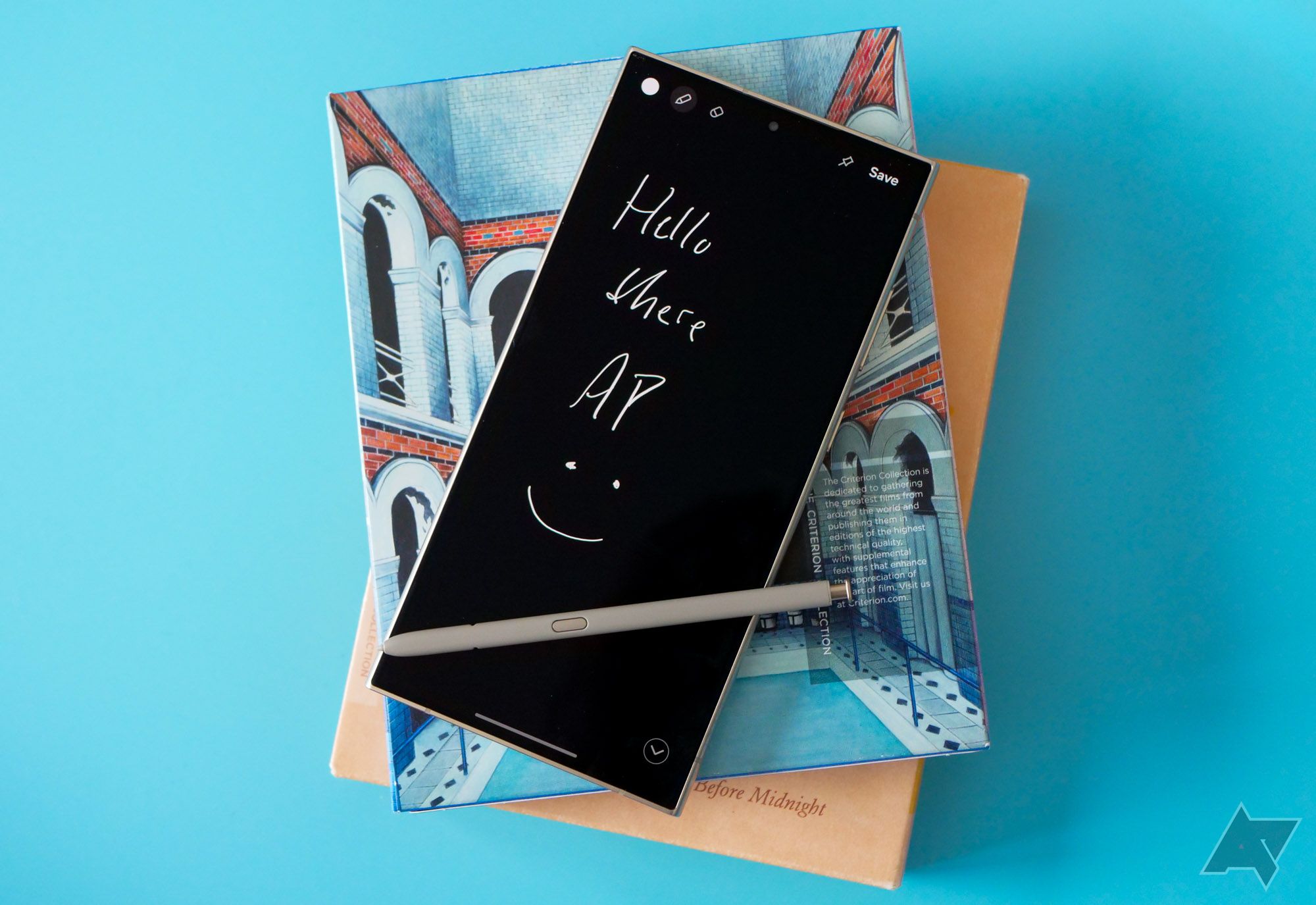
The Samsung Galaxy S24 Ultra is still the best, unless you take photos
Samsung’s latest phablet feels like a do-over
Metro UI is still unmatched a decade later
Live Tiles were everything
I used phones with Microsoft software before Windows Phone 7. Windows Mobile, as it was called, was painful to use. I liked the Motorola Q’s hardware, but Windows Mobile 6 slowed it down, making sending a message or opening an app a chore. Windows Phone 7 brought several improvements, introducing Metro UI and Live Tiles, but Windows Phone 8 is when the software came alive.
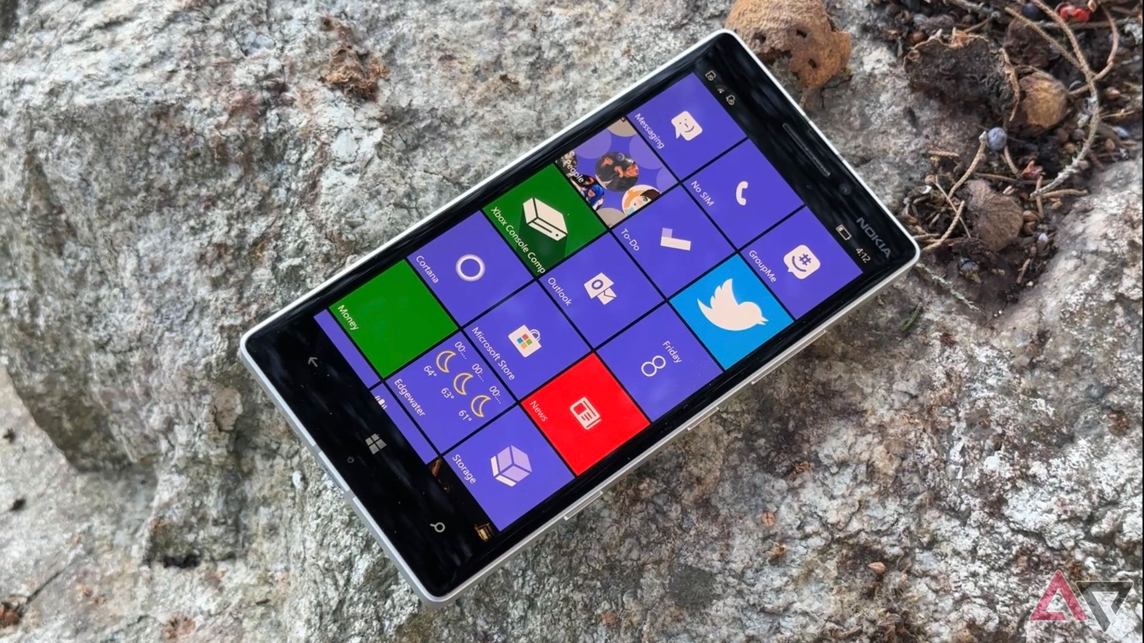
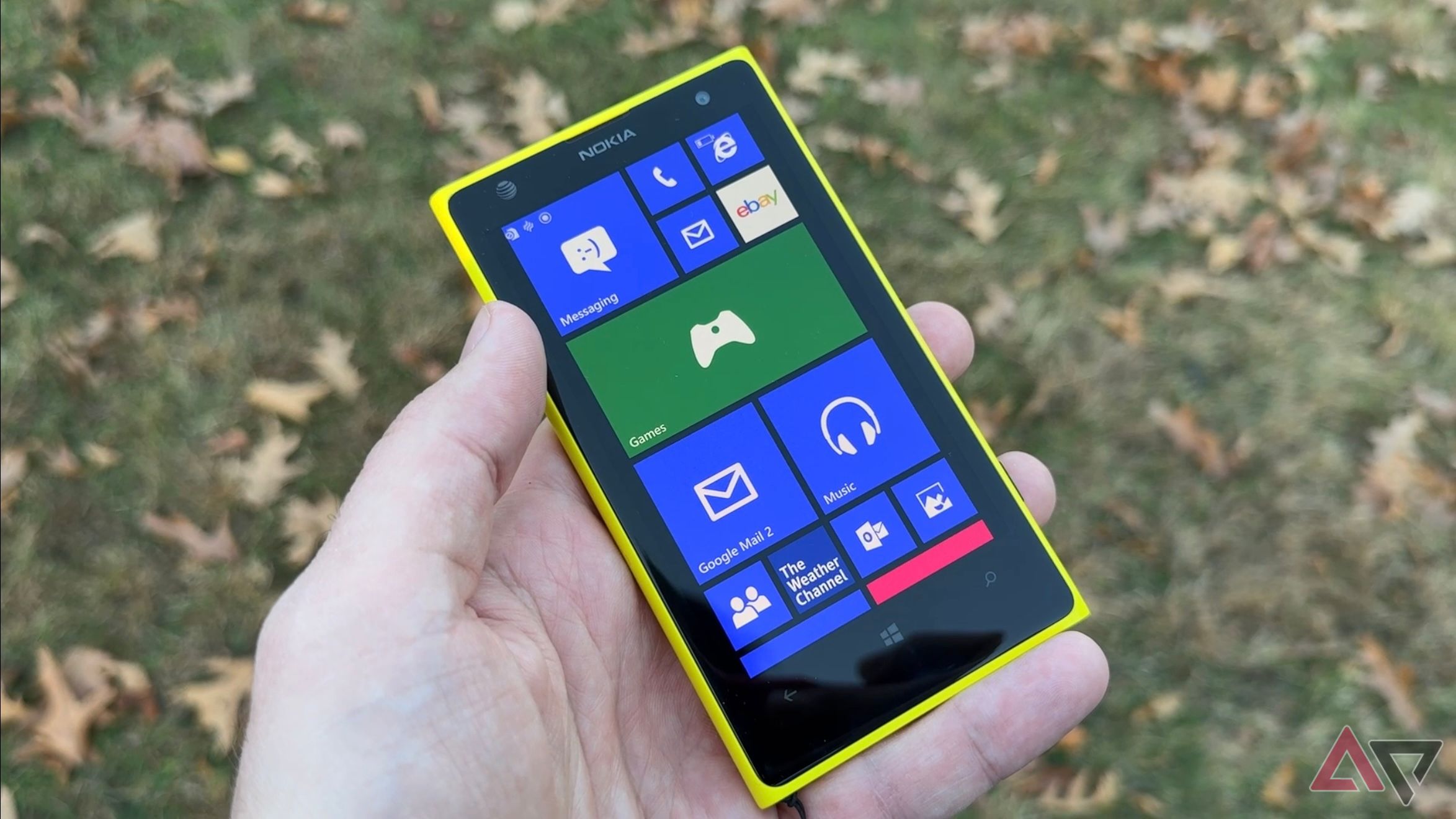
Live Tiles were widgets on steroids. They laid out your entire social life, from friends to gaming, on one customizable board, keeping you updated on everyone in your life. News and weather tiles would flip to show a pertinent picture from the day’s events or a preview of temperatures to come. Everything felt integrated and intuitive. Despite providing a large amount of visual information at a glance, it never felt overwhelming or cluttered. It was elegant and easy-to-use software, which I still miss in 2024.
If you had an Xbox 360 and a Windows Phone, you knew the joys of linking accounts and seeing your avatar and game progress listed. You could receive achievement notifications on your phone and see which friends were online. Rotating lock screen wallpapers were available from Bing, and Windows Phone had a dark mode to conserve battery years before the competition. The infrastructure and user experience were there. However, app developers didn’t back up the platform.
No one picked up the mantle
We’ve never had the same experience
I was excited when Microsoft announced its return to smartphones. I knew the new phone would use Android, but I was hopeful some Metro UI DNA would bleed through. Aside from some subtle design cues, the Microsoft Surface Duo didn’t include much of what made Windows Phone great.
Year after year, I see Android software engineers struggle to develop UI refreshes and new designs for their company’s Android skin.
Don’t get me wrong; I love widgets. They are a significant part of what makes Android fun, and I take full advantage of the customization options. However, widgets feel like windows into individual apps, not a part of a larger ecosystem. My Windows Phone home screen felt alive. I’ve never seen an Android UI give me the same amount of information at a glance. Even experimenting with different launchers, I’ve never found one that matched.
We’re starved for something different
Year after year, I see Android software engineers struggle to develop UI refreshes and new designs for their company’s Android skin. This results in recycled ideas, with many companies opting for similar aesthetics. Even One UI 7, which will be a significant visual change, won’t feel like a new user experience. I don’t think asking one Android OEM to try something different and implement some Metro UI features is too much. Even still, I’d settle for an updated Lumia 1020 in a heartbeat.



GIPHY App Key not set. Please check settings